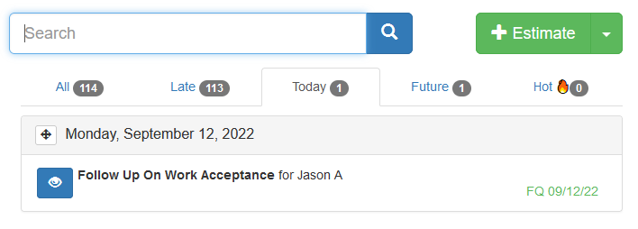
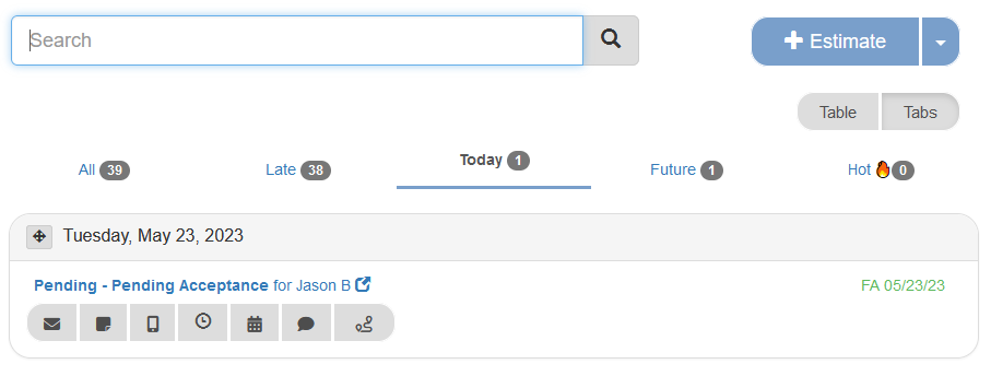
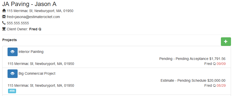
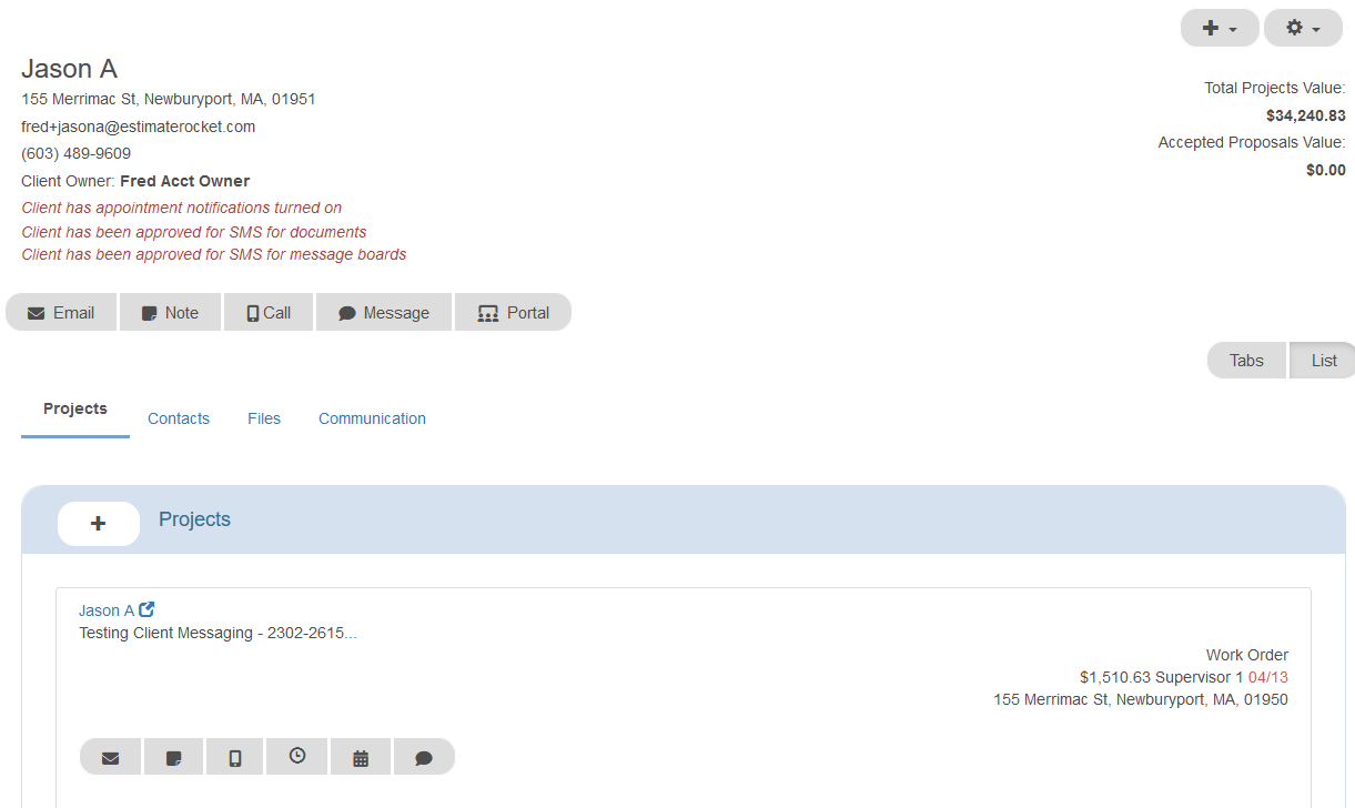
The addition of the quick action buttons has changed the look of the dashboard project area, the project page project area and also the client page project area.
The project 'card' with the action buttons takes up slightly more vertical space than prior especially on the project page due to the additional project information that is available on that screen. The link into the project is no longer the 'view eyeball' but now the text of the project status / customer name.
Dashboard
Before Quick Action Buttons

After Quick Action Buttons

Project Page
Before Quick Action Buttons

After Quick Action Buttons

Client Page
Before Quick Action Buttons

After Quick Action Buttons

The quick action buttons will make specific tasks much quicker in Estimate Rocket.
More helpful articles
Overview of Quick Action Buttons